Do you ever feel like your data is all over the place, like a herd of cats trying to get through a tiny door? Trying to track the origin, transformation, and destination of data can be a daunting task, especially when dealing with complex data sets. That’s where graph visualization libraries come in – they can help you make sense of your data and visualize it in a way that’s easy to understand.
In this blog post, we’ll be taking a look at some of the most powerful graph visualization advanced JS libraries available for data lineage. We’ll be comparing their pros and cons. So buckle up, grab a cup of coffee, and let’s get started!
Linkurious.js
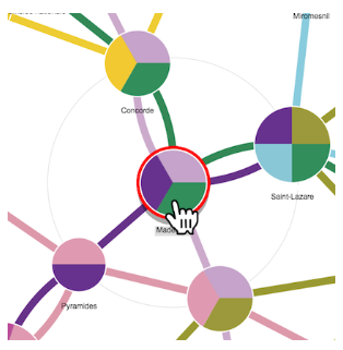
First up is Linkurious.js, a powerful graph visualization library that offers a wide range of features for data lineage. Its powerful search and filtering options make it a great choice for analyzing large and complex data sets. It also has a range of visualization options that allow you to customize your graphs to suit your needs.
But with great power comes great responsibility, and Linkurious.js can be overwhelming for beginners. Its learning curve is steep, and it can take some time to get used to all its features. But once you get the hang of it, you’ll be able to create some amazing visualizations that will make your colleagues green with envy.
Linkurious also has some great examples to get you started and running with creating some of the complex data visualizations – examples.
KeyLines

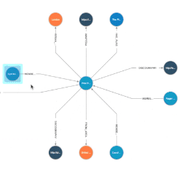
Next up is KeyLines, a flexible graph visualization library that can be used for data lineage as well as other types of network analysis. It offers a wide range of customization options, including interactive controls, styling, and layout algorithms. Its support for real-time data feeds and data streaming makes it a great choice for data sets that are constantly changing.
However, KeyLines can be a bit pricey, and its licensing model may not be suitable for all organizations. It also has a steep learning curve. But if you’re looking for a powerful, customizable graph visualization library, KeyLines is definitely worth considering.
Finding examples of Keylines usage is slightly tricky unless you’re already a member and have a license.
Tom Sawyer Software
Tom Sawyer Software offers a suite of graph visualization and analysis tools that can be used for data lineage. Its advanced layout algorithms, automatic labeling, and interactive controls make it a powerful option for complex data sets. It also has a range of customization options, including custom icons and labeling schemes.
The downside of Tom Sawyer Software is that its licensing model may not be suitable for all organizations. It also has a steep learning curve and may take some time to get used to its features. But if you’re willing to invest in a powerful graph visualization library, Tom Sawyer Software is definitely worth considering.
yFiles
Last but not least is yFiles, a comprehensive graph visualization library that provides a range of features for data lineage. Its support for different data formats, customizable layout algorithms, and interactive controls make it a great choice for analyzing complex data sets. It also offers a range of customization options, including custom styles and labels.
However, yFiles can be pretty expensive. It also has a steep learning curve and can take some time to get used to its features.
Here’s a quick comparison of these libraries –
| Library | Price | Developer Satisfaction | Quality of Documentation | Complexity |
| KeyLines | Expensive | High | Good | Medium to High |
| Linkurious.js | Relatively Affordable | High | Fair | High |
| Tom Sawyer Software | Custom pricing | High | Excellent | High |
| yFiles | Custom pricing | High | Excellent | High |
Both KeyLines and Linkurious are similar on many key parameters –
Features
Both KeyLines and Linkurious offer a range of features that enable users to create interactive network visualizations. Some of the key features of both tools include:
- Interactive visualization with animations, filters, and drill-downs.
- Ability to import data from multiple sources.
- Supports multiple graph layouts and customizations.
- Integrated analytics and clustering algorithms.
Types of Graphs
Both tools offer support for a range of graph types, including network graphs, flow diagrams, timelines, chord diagrams, and geo-maps. This flexibility enables users to create visualizations for various industries and use cases.
Ease of Adoption
Both KeyLines and Linkurious are easy to use and implement with clear documentation. They offer a range of tutorials and webinars and provide a dedicated support team. This ease of adoption makes it possible for users to start creating visualizations quickly.
Price
Both tools offer pricing upon request. The cost of the tools depends on the specific requirements and deployment needs.
Examples
Both KeyLines and Linkurious offer a range of demos and examples on their website. They also provide customer case studies that demonstrate the effectiveness of their tools in various industries.
Documentation
Both tools offer extensive documentation and developer resources. They provide API references and code samples, making it easy for developers to integrate the tools into their workflows.
Usage
Both KeyLines and Linkurious are suitable for creating interactive network visualizations for various industries. They can be used for fraud detection, cybersecurity, supply chain management, and more.
Complexity of Visualization
Both tools can handle complex data sets and visualizations with ease. They offer support for large-scale deployments and provide high-performance rendering.
Developers Sentiments
Developers using both KeyLines and Linkurious have generally positive sentiments about the tools. KeyLines is known for its ease of use and customer support, while Linkurious is known for its scalability and flexibility. Some users have reported limited customization options with KeyLines, while some have reported difficulty in setting up Linkurious.
Hence, deciding which one to choose comes down to the availability of the libraries in your organization, awareness, existing usage, and dev support in your group.
And that’s a wrap! We hope this blog post has given you a good overview of some of the most powerful graph visualization advanced JS libraries available for data lineage. Each library has its pros and cons, and it’s up to you to decide which one is the best fit for your organization. Among the listed libraries – Linkurious and Keylines are my favorites. In the next blog, we’ll take a look at which one to consider and which parameters to consider while opting for a visualization library.
Leave a Reply